24 Cluster Analysis
24.1 Introduction
TipCluster analysis
The process of using algorithms to assign observations to groups by calculating similarity between the observations (rows) using their variables (columns). The goal is to minimize the similarity between groups and maximize the similarity within groups.
Cluster assignments are the arbitrary labels for the groups (i.e. cluster 1 and cluster 2). Cluster assignments can be used for data visualization and calculating group-wise summary statistics like cluster means.
In practice, clusters can be used to create typologies and to summarize rows in a complicated data set. At the Urban Institute, researchers have used cluster analysis to create neighborhood types (Coulton, Theodos, and Turner, n.d.) and to categorize counties based on financial wellness indicators.
24.1.1 Intuitive Explanation
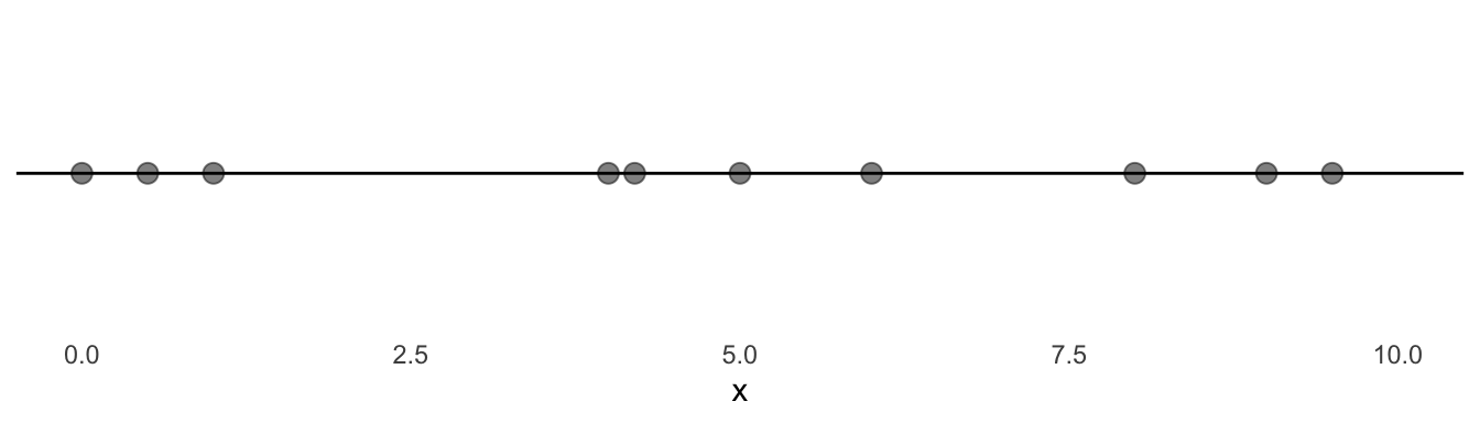
Example 1
Consider the following 10 observations. How might you meaningfully cluster the observations?
Example 2
Consider the following 10 observations. How might you meaningfully cluster the observations?
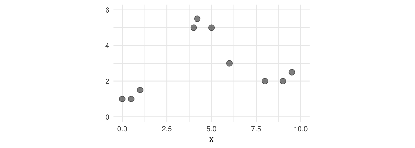
These two examples raise three important questions:
- What is a formal method to calculate similarity between the observations?
- How can we scale up this process to many observations and many variables?
- How many groups should be created?
24.1.2 Euclidean Distance
Euclidean distance is very popular for cluster analysis. It offers one formal method to calculate similarity between the observations.
One variable:
\[Dist_{ij} = \sqrt{(x_i - x_j)^2}\]
Multiple variables:
\[Distance_{ij} = \sqrt{\sum_{k = 1}^p(x_{ik} - x_{jk})^2}\]
Where \(i\) is the first observation, \(j\) is the second observation, \(k\) is the \(k^{th}\) variables, and \(p\) is the number of variables.
24.2 Clustering Process
When the clusters are clear and there aren’t many variables, we can intuit reasonable groups (like above). But what if there are 30 variables? Or 500 observations?
Fortunately, there are numerous algorithms to address these issues and that answer the question “How can we scale up a process to many observations and many variables?”
TipK-means
K-means clustering is a popular clustering algorithm. It is different than KNN but uses many of the same mathematical ideas. We walk through the K-means algorithm below.
Consider the following data set.
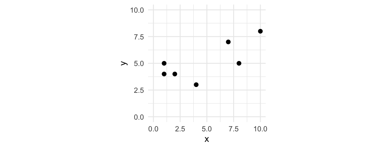
Step 1: Randomly place K centroids in your n-dimensional vector space
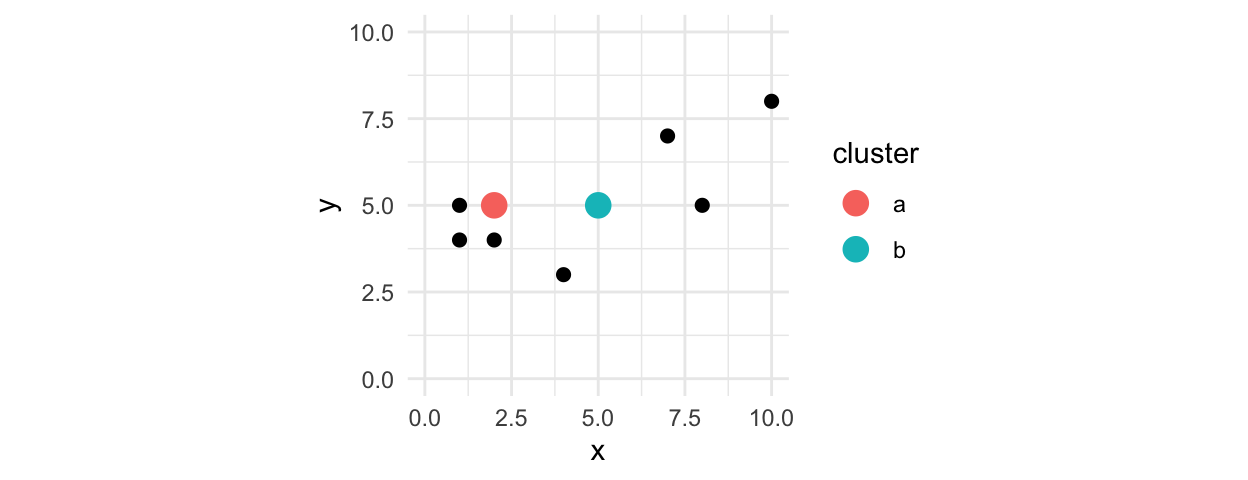
Step 2: Calculate the nearest centroid for each point using a distance measure
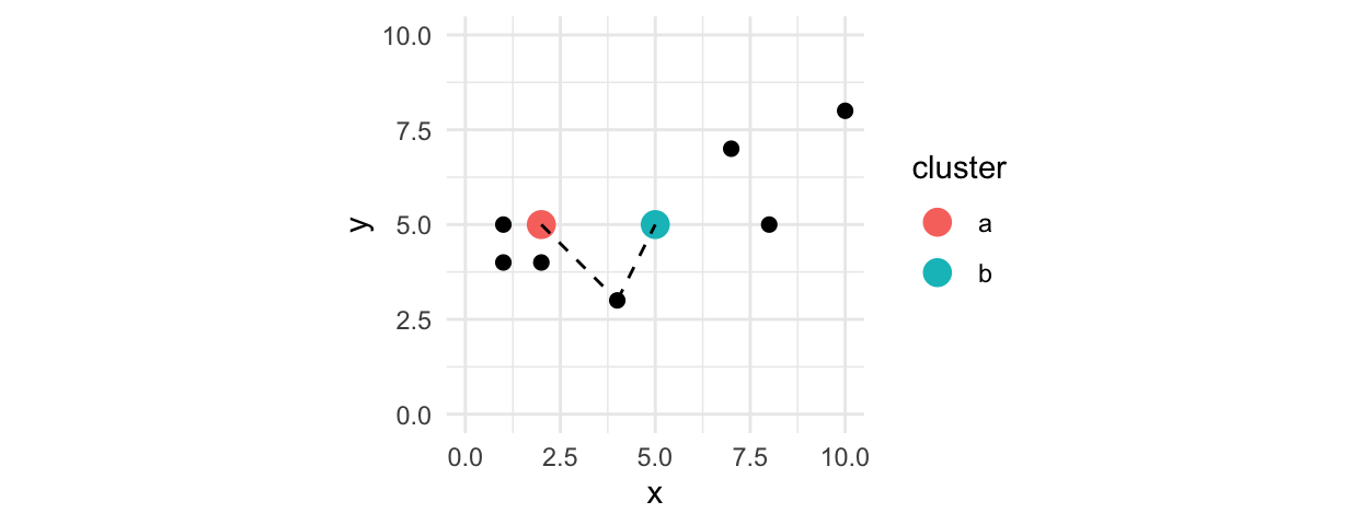
Step 3: Assign each point to the nearest centroid
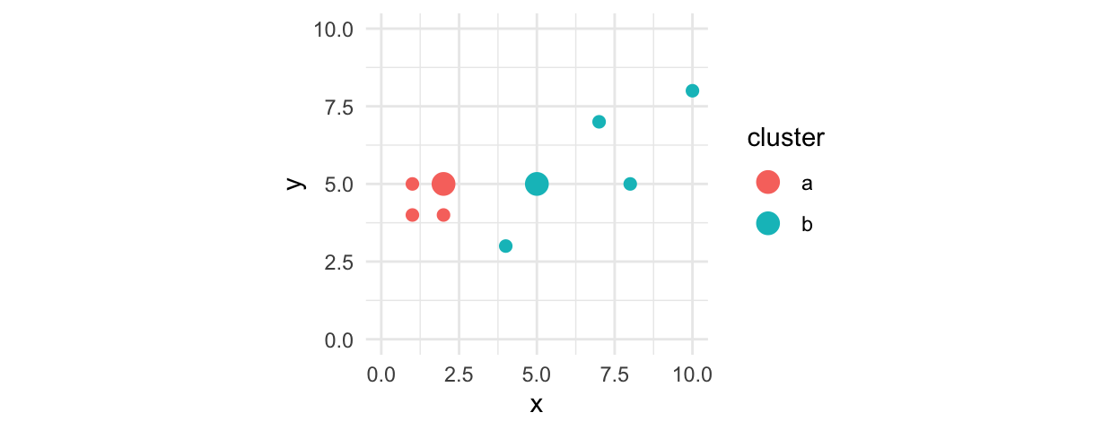
Step 4: Recalculate the position of the centroids based on the means of the assigned points
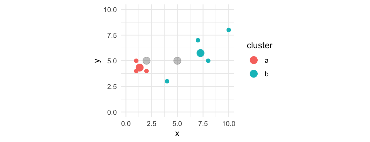
Step 5: Repeat steps 2-4 until no points change cluster assignments
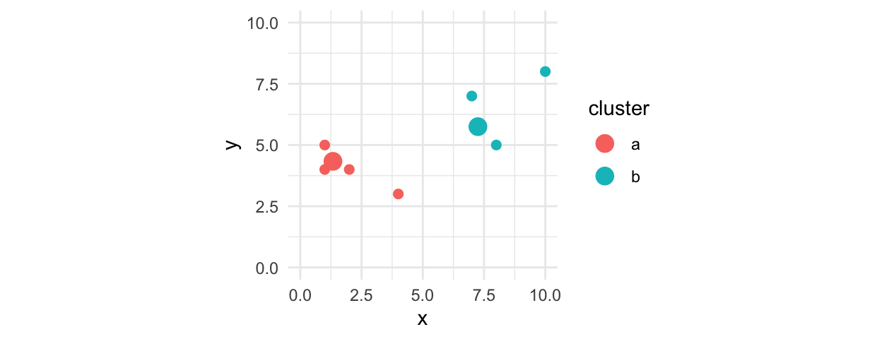
Note:
- The data typically need to be on the same scale.
- K-means clustering is not robust to outliers.
- The cluster assignments are not deterministic due to the random point placement in step 1.
24.2.1 library(tidyclust)
We will use library(tidyclust) for cluster analysis. The goal of tidyclust is to provide a tidy, unified interface to clustering models. The package is closely modeled after the parsnip package in library(tidymodels).
24.2.2 Implementation
Example 1
Consider the state data from earlier.
library(tidyverse)
library(broom)

# select numeric variables of interest
state_data <- urbnmapr::statedata |>
  select(hhpop, horate, medhhincome)

# create a recipe
state_kmeans_rec <- recipe(
  formula = ~ .,
  data = state_data
) |>
  step_range(all_predictors()) #scale between 0 and 1

state_data_numeric <- state_kmeans_rec |>
  prep() |>
  bake(new_data = state_data)

# create a kmeans model object four clusters
state_kmeans_spec <- k_means(
  num_clusters = 4 # number of clusters
) |>
  set_engine(
    "stats",
    nstart = 100 # number of random starts
  )

# create a workflow
state_kmeans_wflow <- workflow(
  preprocessor = state_kmeans_rec,
  spec = state_kmeans_spec
)

# set a seed because the clusters are not deterministic
set.seed(20200205)

# fit the model
state_data_kmeans <- state_kmeans_wflow |>
  fit(data = state_data)

# view the model results
tidy(state_data_kmeans) |>
knitr::kable(digits = 2)| hhpop | horate | medhhincome | size | withinss | cluster |
|---|---|---|---|---|---|
| 0.13 | 0.82 | 0.26 | 28 | 1.00 | 1 |
| 0.10 | 0.78 | 0.71 | 18 | 0.91 | 2 |
| 0.71 | 0.55 | 0.48 | 4 | 0.32 | 3 |
| 0.00 | 0.00 | 0.97 | 1 | 0.00 | 4 |
Example 2
Recall the votes data set from the previous tutorial.
Rows: 100 Columns: 495
── Column specification ────────────────────────────────────────────────────────
Delimiter: ","
chr   (2): name, party
dbl (493): v1, v2, v3, v4, v5, v6, v7, v8, v9, v10, v11, v12, v13, v14, v15,...

ℹ Use `spec()` to retrieve the full column specification for this data.
ℹ Specify the column types or set `show_col_types = FALSE` to quiet this message.
kmeans_rec <- recipe(
formula = ~ .,
data = votes
) |>
step_select(all_numeric())
rec_pca <- recipe(
formula = ~ .,
data = votes
) |>
step_pca(all_numeric(), id = "pca")
votes_pca <- rec_pca |>
prep() |>
bake(new_data = votes)
# calculate pct variance explained by components
# the first two components explain 45% and 29% of the variance
rec_pca |>
prep() |>
tidy(id = "pca", type = "variance") |>
filter(terms == "variance") |>
mutate(pct_var = value/sum(value)) |>
slice_head(n = 2)# A tibble: 2 × 5
terms value component id pct_var
<chr> <dbl> <int> <chr> <dbl>
1 variance 217. 1 pca 0.450
2 variance 142. 2 pca 0.294# create a kmeans model object with two clusters
kmeans_spec <- k_means(
num_clusters = 2 # number of clusters
) |>
set_engine(
"stats",
nstart = 100 # number of random starts
)
# create a workflow
kmeans_wflow <- workflow(
preprocessor = kmeans_rec,
spec = kmeans_spec
)
# fit the model
votes_kmeans_2 <- kmeans_wflow |>
fit(data = votes)
bind_cols(
select(votes, name, party),
cluster = votes_kmeans_2 |>
extract_cluster_assignment() |>
pull(.cluster)
) |>
count(party, cluster)# A tibble: 3 × 3
party cluster n
<chr> <fct> <int>
1 D Cluster_2 44
2 I Cluster_2 2
3 R Cluster_1 54We see that the estimated clusters fit the party variable even though it wasn’t included in the model.
TipLatent variable
Latent variable (hidden variable): An unobserved variable inferred through statistical methods.
Suppose we didn’t known party. Then cluster analysis is the process of trying to discover a latent variable or latent groups in the data. In general, cluster analyses will be much tidier if there is a strong latent process driving the latent groups. For example, imagine latent groups for children, women, and men when looking at heights and weights without observing age or sex.
In addition to identifying data and variables that capture latent structure in our data, we also need to choose how many latent groups are in the data! Consider the above example with 3 groups:
# create a kmeans model object with three clusters
kmeans_spec <- kmeans_spec |>
  set_args(num_clusters = 3)

# create a workflow
kmeans_wflow <- workflow(
  preprocessor = kmeans_rec,
  spec = kmeans_spec
)

# fit the model
votes_kmeans_3 <- kmeans_wflow |>
  fit(data = votes)

bind_cols(
  select(votes, name, party),
  cluster = votes_kmeans_3 |>
    extract_cluster_assignment() |>
    pull(.cluster)
) |>
  count(party, cluster)
# A tibble: 4 × 3
party cluster n
<chr> <fct> <int>
1 D Cluster_2 44
2 I Cluster_2 2
3 R Cluster_1 31
4 R Cluster_3 2324.2.3 Picking the number of clusters
The main considerations when picking a number of clusters are theory and application. Is the objective to find three archetypal communities? Does the visualization need five groups?
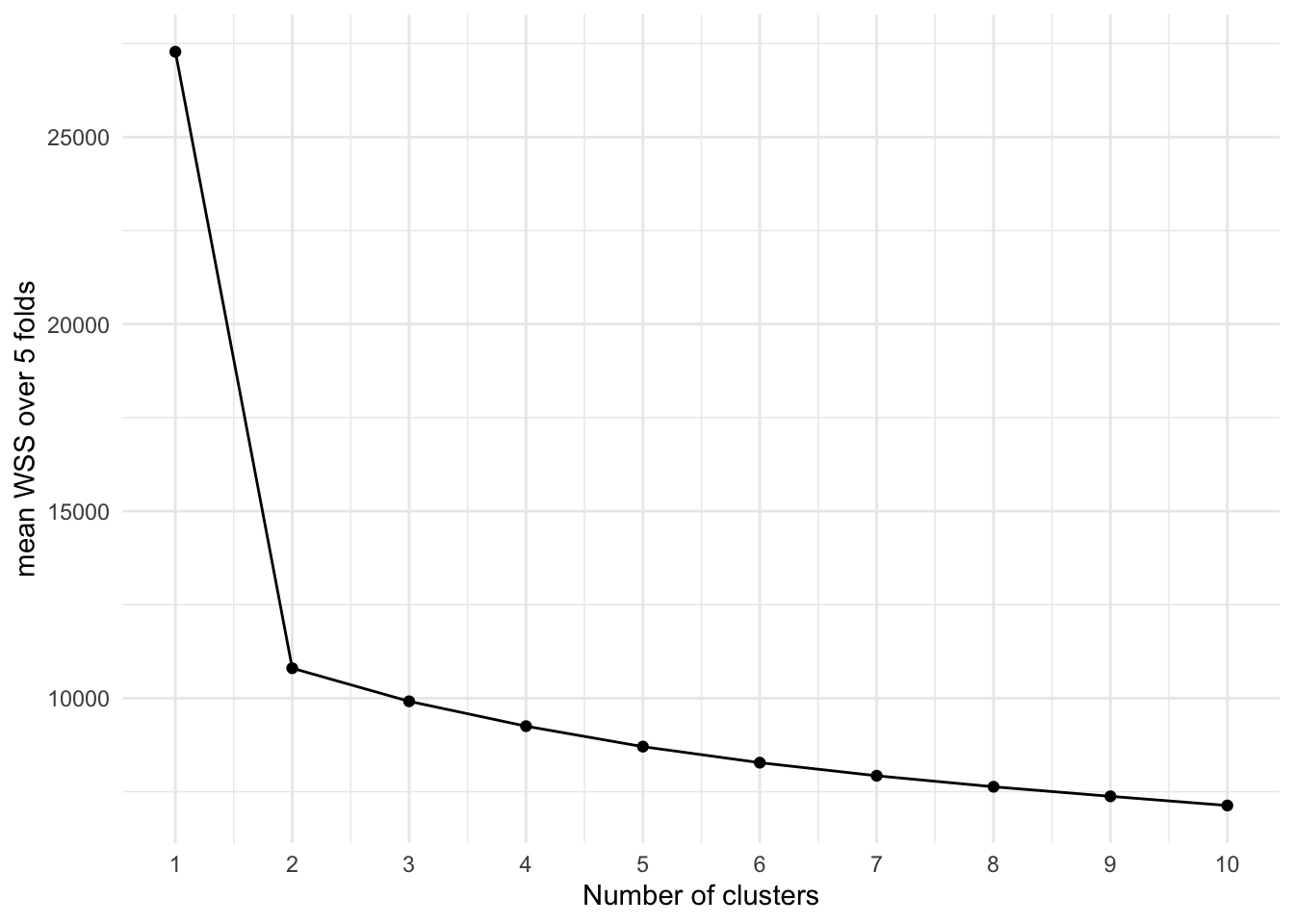
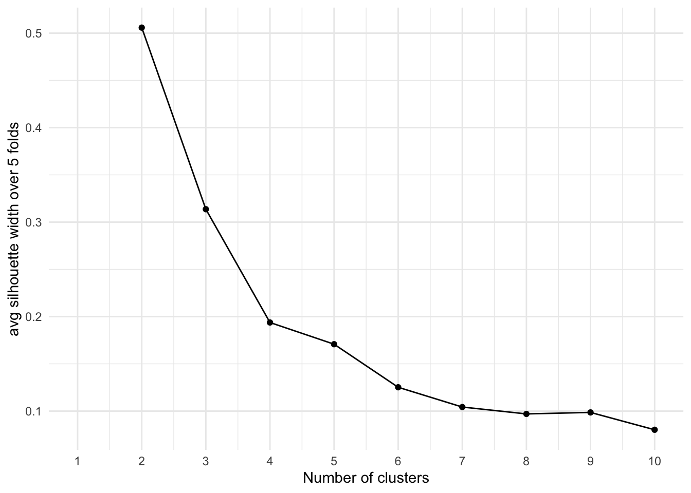
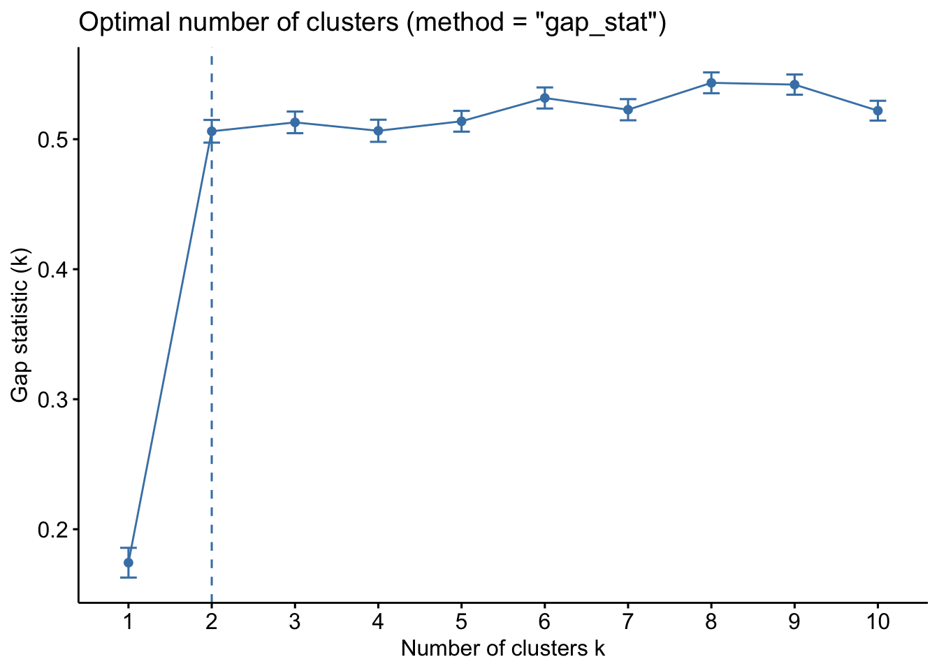
Beyond theory and application, there are analytic measures that can help determine the optimal number of clusters. The best number of clusters usually can be picked with the “elbow method” by choosing the number where a kink occurs in the following plots. We can tune() the number of clusters in library(tidyclust) similar to the approach we learned to tune model hyperparameters in library(tidymodels).
Consider the votes data where there are two clear clusters.
# set up cross-validation
votes_cv <- vfold_cv(votes, v = 5)

kmeans_spec <- k_means(
  num_clusters = tune() # set hyperparameter tuning for number of clusters
) |>
  set_engine(
    "stats",
    nstart = 100 # number of random starts
  )

# create a workflow
kmeans_wflow <- workflow(
  preprocessor = kmeans_rec,
  spec = kmeans_spec
)

# create tuning grid
clust_num_grid <- grid_regular(
  num_clusters(),
  levels = 10
)

# see the tuning grid
clust_num_grid
# A tibble: 10 × 1
num_clusters
<int>
1 1
2 2
3 3
4 4
5 5
6 6
7 7
8 8
9 9
10 10Total within sum of squares
The simplest measure is total within sum of squares. This is simply the sum of squared errors within groups, which should monotonically decrease as the number of clusters increases.
Average silhouette width
The silhouette score is an observation-level measure of cohesion within an observation’s group and separation from the closest group. It ranges from -1 to +1, with higher numbers representing better clusters. Negative numbers suggest that an observation has been assigned to an incorrect cluster. 0 indicates that an observation is on the boundary.
Gap statistics
The gap statistic (Tibshirani, Walther, and Hastie 2002) compares the change in within-cluster dispersion with a reference null distribution that represents data without clear clusters. Higher numbers are better. It takes the longest to calculate because it requires Monte Carlo simulations (bootstrapping) to calculate the null distribution. The gap statistic is not yet implemented within library(tidyclust), so we use library(factoextra) to calculate the gap statistic. Note that this function fits the cluster model and calculates the metric.
kmeans_spec <- k_means(
  num_clusters = 5 # number of clusters
  ) |>
  set_engine(
    "stats",
    nstart = 100 # number of random starts
  )

# create a workflow
kmeans_wflow <- workflow(
  preprocessor = kmeans_rec,
  spec = kmeans_spec
)

# fit the model
votes_kmeans_5 <- kmeans_wflow |>
  fit(data = votes)

votes_clusters <- bind_cols(
  select(votes, name, party),
  select(votes_pca, PC1, PC2),
  cluster2 = votes_kmeans_2 |>
    extract_cluster_assignment() |>
    pull(.cluster),
  cluster5 = votes_kmeans_5 |>
    extract_cluster_assignment() |>
    pull(.cluster)
)

names <- c("Bernie Sanders", "Ted Cruz", "Joe Manchin", "Susan Collins")

ggplot() +
  geom_point(
    data = votes_clusters,
    mapping = aes(PC1, PC2, color = factor(cluster2)),
    alpha = 0.5
  ) +
  geom_text(
    data = filter(votes_pca, name %in% names),
    mapping = aes(PC1, PC2, label = name)
  ) +
  scale_color_manual(values = c("blue", "red")) +
  labs(
    title = "K-Means with K=2 and PCA",
    x = "PC1 (0.45 of Variation)",
    y = "PC2 (0.29 of Variation)"
  ) +
  theme_minimal() +
  guides(text = NULL)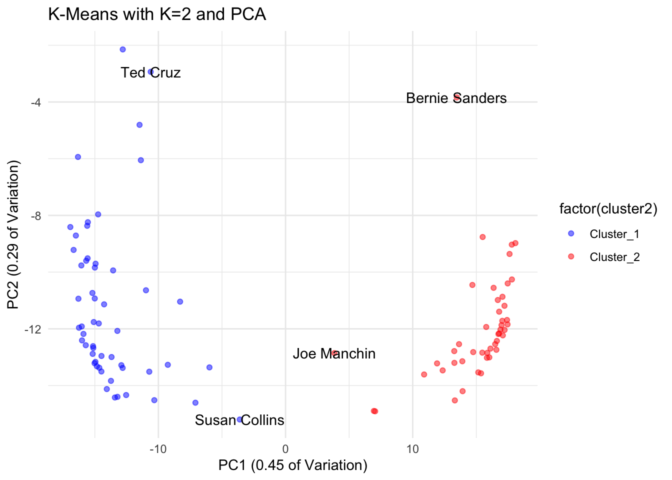
ggplot() +
  geom_point(
    data = votes_clusters,
    mapping = aes(PC1, PC2, color = factor(cluster5)),
    alpha = 0.5
  ) +
  geom_text(
    data = filter(votes_pca, name %in% names),
    mapping = aes(PC1, PC2, label = name)
  ) +
  labs(
    title = "K-Means with K=5 and PCA",
    x = "PC1 (0.45 of Variation)",
    y = "PC2 (0.29 of Variation)"
  ) +
  theme_minimal() +
  guides(text = NULL)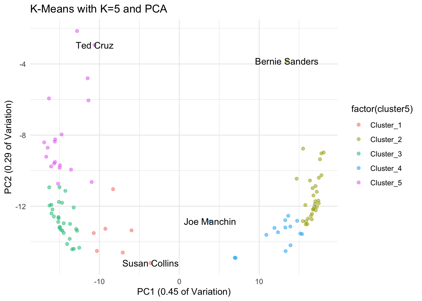
24.2.4 Additional Considerations
Picking variables
Start with a subset of numeric variables based on subject matter expertise. In general, clustering algorithms work well with all continuous variables or all recoded categorical variables. Mixing variable types is possible but requires extra care.
| hhpop | horate | medhhincome |
|---|---|---|
| 1846380 | 0.681 | 44700 |
| 250183 | 0.631 | 70600 |
| 2463012 | 0.621 | 51000 |
| 1144657 | 0.655 | 42000 |
| 12895471 | 0.537 | 64600 |
| 2074517 | 0.639 | 63500 |
Scaling variables
The variable hhpop will swamp horate and medhhincome because of its scale. We need to put the variables on the same scale. The first option is to normalize variables by subtracting the mean and dividing by the standard deviation.
\[\tilde{x_i} = \frac{x_i - \bar{x}}{s_{x}}\]
step_normalize() rescales variables to have mean of 0 and standard deviation of 1.
The second option is to min-max rescale the variable to a 0 to 1 or 0 to 100 scale.
\[\tilde{x_i} = \frac{x_i - x_{min}}{x_{max} - x_{min}}\]
step_range() min-max rescales data to a [0, 1] range or a custom range.
Normalization and min-max rescaling remove units from variables and put variables on the same scale.
24.2.5 Diagnostics
Consider the k-means clusters from the states data.
| hhpop | horate | medhhincome | size | withinss | cluster |
|---|---|---|---|---|---|
| 0.13 | 0.82 | 0.26 | 28 | 1.00 | 1 |
| 0.10 | 0.78 | 0.71 | 18 | 0.91 | 2 |
| 0.71 | 0.55 | 0.48 | 4 | 0.32 | 3 |
| 0.00 | 0.00 | 0.97 | 1 | 0.00 | 4 |
There are several ways that we can evaluate the quality of the clusters after the fact.
Expert check
| cluster | mean(hhpop) | mean(horate) | mean(medhhincome) |
|---|---|---|---|
| Cluster_1 | 1895957 | 0.665 | 49283.96 |
| Cluster_2 | 1545705 | 0.653 | 65555.56 |
| Cluster_3 | 9253386 | 0.579 | 57250.00 |
| Cluster_4 | 281788 | 0.402 | 75000.00 |
Stability (sensitivity analysis)
It is important to conduct a stability (sensitivity) analysis, in which the final specification of the cluster analysis is run \(p\) times, where \(p\) is the number of variables in the cluster analysis, each time removing one variable and checking how many observations remain in similar groups as a result.
24.2.6 Visualizing clusters with a scatter plot matrix
A scatter plot matrix allows for the pairwise comparison of all numeric variables. Adding cluster membership as colors shows the membership of each point in the scatter plots.
Note
Scatter plot matrices become unwieldy with many variables or many observations. If there are too many observations or too many variables, visualize a representative subset.
Note
Every cluster need not differ by every variable for a meaningful multivariate grouping to exist.
library(GGally)

#add cluster membership to the origin data
bind_cols(
  state_data,
  cluster = state_data_kmeans |> extract_cluster_assignment() |> pull(.cluster)
) |>
  filter(cluster != "Cluster_4") |>
  # create a scatter plot matrix
  ggpairs(
    columns = 1:3,
    mapping = aes(color = factor(cluster)),
    diag = list(continuous = wrap("densityDiag",
                                  alpha = 0.8,
                                  color = NA))
  ) +
  theme_minimal()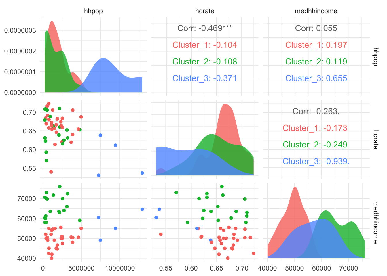
Visualizing clusters with PCA
A scatter plot matrix requires \(\frac{p(p - 1)}{2}\) plots to show \(p\) variables. This can quickly grow unwieldy.
We can use PCA to plot much of the variation in the data in two dimensions. The output shows that the first two components cumulatively explain more than 90% of variation in the data.
# run PCA
rec_pca <- recipe(
  formula = ~ .,
  data = state_data_numeric
) |>
  step_pca(all_numeric(), id = "pca")

# calculate pct variance explained by components
# the first two components explain 88% and 8% of the variance
rec_pca |>
  prep() |>
  tidy(id = "pca", type = "variance") |>
  filter(terms == "variance") |>
  mutate(pct_var = value/sum(value)) |>
  slice_head(n = 2)
# A tibble: 2 × 5
terms value component id pct_var
<chr> <dbl> <int> <chr> <dbl>
1 variance 0.860 1 pca 0.882
2 variance 0.0750 2 pca 0.0769# create and visualize the group membership of observations in the components
bind_cols(
states_pca,
cluster = state_data_kmeans |> extract_cluster_assignment() |> pull(.cluster)
) |>
ggplot(aes(PC1, PC2, color = factor(cluster))) +
geom_point(size = 3) +
labs(title = "State Data Clusters and PCA") +
theme_minimal()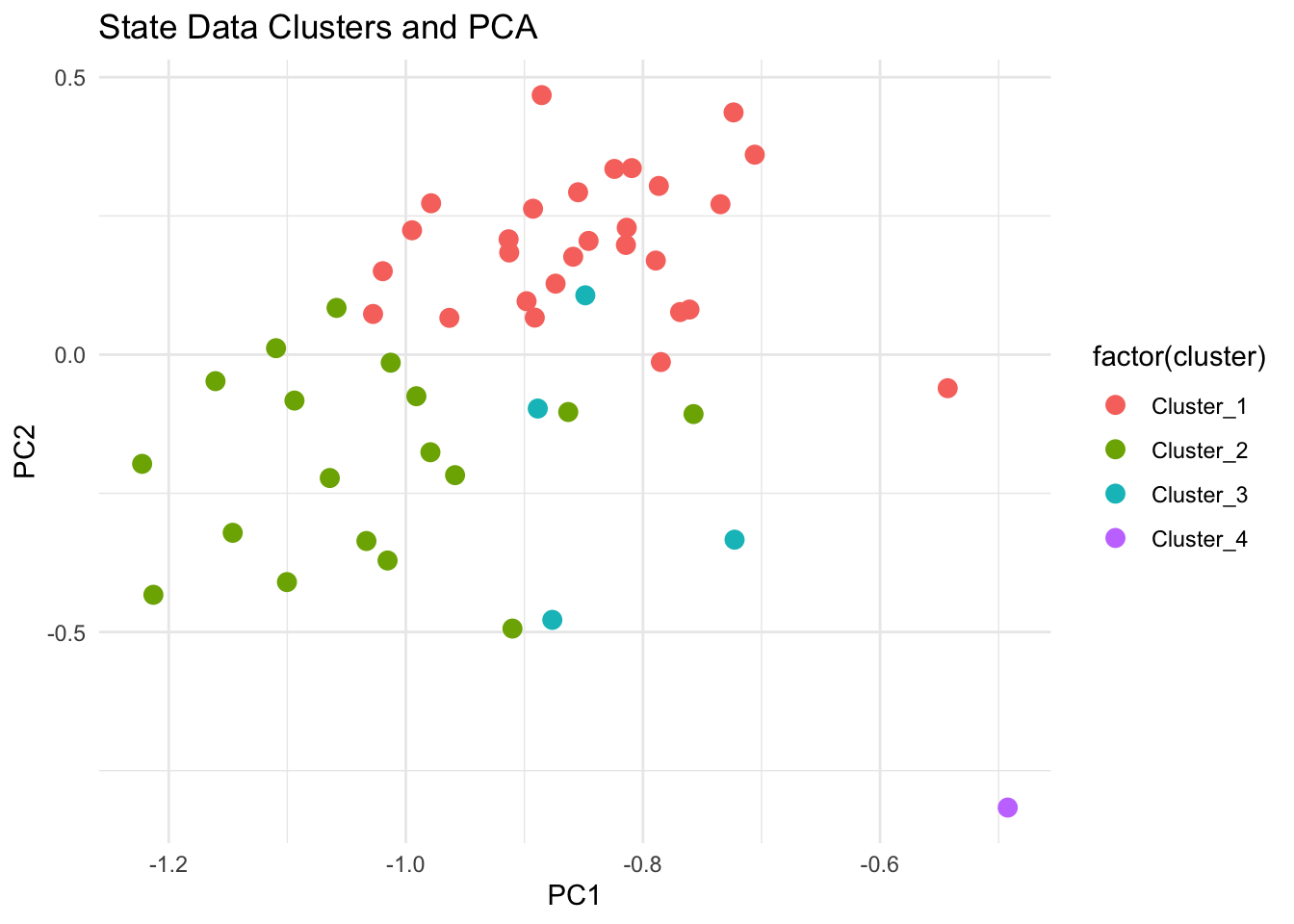
24.2.7 Putting it all together
- Clearly define the question of interest
- Pick the variables that will be considered
- Recode categorical variables to dummy variables
- Rescale variables
- Check the variables for high correlations
- Apply reweighting or variable selection to create a mostly uncorrelated subset
- Pick an algorithm
- Estimate the clusters and pick an optimal number of clusters
- Diagnostics
- Expert check
- Stability analysis
- Visualize with PCA
24.3 Example projects
- Disrupting Food Insecurity (feature, technical appendix)
- This is a good example of explaining the clusters after assigning cluster membership.
- Residential Mobility and Neighborhood Change: Real Neighborhoods Under the Microscope (Coulton, Theodos, and Turner (n.d.))
- Beyond Red vs. Blue: The Political Typology (blog)
- Who Profits from Amateurism? Rent Sharing in Modern College Sports Page 52
24.4 Appendix
Partition-based algorithms
This blog post is a thorough background on K-means clustering.
Hierarchical models
Agglomerative hierarchical clustering: Each element starts as a single-element cluster and are combined into bigger clusters.
library(cluster)
library(dendextend)

# specify hierarchical cluster model
state_hier_spec <- hier_clust(
  num_clusters = 4,
  linkage_method = "average"
) |>
  set_engine("stats")

# fit the model
hc_fit <- state_hier_spec |>
  fit(~ ., data = state_data_numeric)

# add state labels
labels(hc_fit$fit) <- urbnmapr::statedata$state_name[hc_fit$fit$order]

# create a dendrogram of the clusters
plot(
  hc_fit$fit,
  cex = 0.6,
  hang = -1
)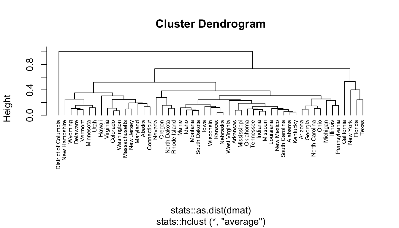
Use cutree() to pick a height and assign group membership to observations based on the height. The height should be determined by the number of desired clusters.
Divisive hierarchical clustering begins with a single cluster and divides it into smaller clusters. Agglomerative hierarchical clusters is good at finding small groups. Divisive hierarchical clustering is good at finding large groups. Divisive hierarchical clustering is not currently implemented in library(tidyclust). It can be run using the diana() (for Divisive Analysis) function in library(cluster).
This blog post is a good deeper dive into hierarchical clustering.
Density-based algorithms
DBSCAN can be implemented with library(dbscan).
Model-based algorithms
Gaussian Mixture Modeling can be implemented with library(mclust). This blog is a thorough introduction.